Because Sometimes Pictures Are Easier to Read than Numbers
Some people reckon that data is boring. However, oodles of figures can be very intimidating, particularly if you’re a visual person, and perhaps those same people would have a different opinion if the data was arranged in a way that made it easier to understand.
Enter stage left, the infographic. A cross between information and a graphic, the infographic transforms seemingly boring and definitely unrelatable data into a story that makes it easier for our brains to comprehend.
Simply put, the humble infographic makes it easier to understand a lot of information by making it visual. Graphics, charts and pictures turn at-first-glance perplexing data into a story that’s easy to understand, drives awareness and enables the reader to come away with increased understanding, and drives traffic to your business.
So how do you create an effective infographic?
Keep it simple
The point of breaking your data down into visual chunks is because it’s too confusing at first glance. Don’t, then, fall into the trap of making your infographic too busy or crammed. Establish your key points, create short and snappy one-liners associated with each piece of data you’re using, and keep every graphic you use clear and concise. The point of your infographic is to help the reader instantly understand what you’re saying. If they don’t, redesign your infographic.

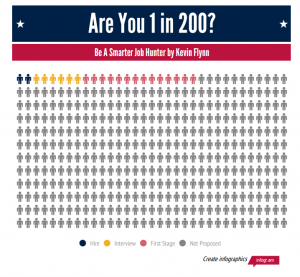
Here’s an example of a clear and easy-to-read infographic (credit: Hubspot).
Keep it creative
Creating an infographic doesn’t mean you pull a few key numbers out of a sentence and put them in a funky colour or font. Make it fun for the reader by visualising your data in clear way so they instantly understand what you’re trying to say – like this one (credit: Hubspot).
Keep it intriguing
Don’t give away everything in the title, because would be the point of making your infographic in the first place? Use enticing titles and short statements to encourage the reader to keep reading.
Keep it relatable
If you can turn your seemingly boring data into a relatable story, you’ve instantly won over your audience. Apply it to a scenario that your readers can relate to.
Keep it easy to navigate
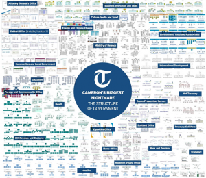
While your data might be interesting and important, white space will make it easier to digest. That’s where the power of graphic design comes into play. Be sure to incorporate enough white space that gives your graphics room to breathe and comprehend, without missing the point. This example definitely needs some white space (although judging by the context of the infographic, that’s probably the point) (credit: Kissmetrics).
Keep it accurate
Always check your facts and figures. Make sure your stats are accurate, your sources are reliable (remember to cite these, usually at the very end), and your graphical representation of your data lines up correctly.
Need a hand developing an infographic? Talk to the friendly Onepost team; we have graphic design options that will work for your business.


