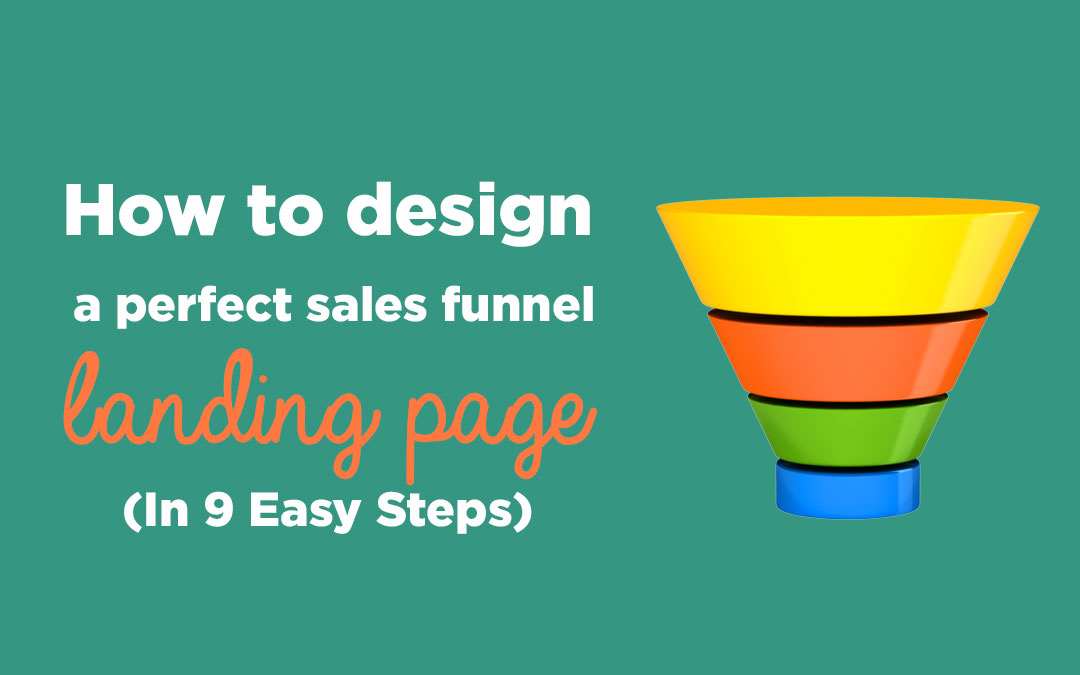
How to design a perfect sales funnel landing page (In 9 Easy Steps)
It was a surprise to learn that most businesses focus on driving leads to their site, but don’t actually focus on how many of those leads actually convert. The first page that people arrive at of your website, also known as the landing page, should be critically examined and constructed to convert as many of those visitors into paid customers.
Here are the nine steps to constructing the perfect sales funnel landing page. They are in numerical order, and the landing page should be built as such.
1.Headline
Possibly the most critical part of your landing page is the first words that a visitor will read. Statistically, 90% of readers of a Headline will also read your Call To Action*. So how do you write a good headline?
Don’t fall into the trap and make the headline your company brand or logo, customers want to know what you can do FOR them (Benefit), rather than who you are.
For example:
“Unlimited Cloud Storage”
or
“Simple Healthy Meal Planning For Every Day Of The Week”
But remember a headline is a promise! You must have the value and the offer to fulfill that promise later in the landing page (In the form of your product or service!).
2.Hero Image or Video
Using a hero image can easily highlight the product and service to a potential customer. A video can actually convert up to 86% more than a simple photo**. Consider having a video highlighting the entire sales funnel (So go over each key feature and finish with a call to action) that will sell to people for you, in a minute or less.
3.Key Features
The third step is to list the key features AND benefits of your product. Have 3-5 items in a list that clearly indicate what your product or service does, how the user can benefit.
4.Previous Clients
The next three steps involve the concept of social proof. This is the idea of building trust with your readers and that you can provide them with a level of quality they will be satisfied with.
The first point is very much linked to the next one, but it is great if you have a bunch of real brands that you have worked with in the past. This is as simple as placing their logos on your page, with a link to the work that you have done with them. This is very powerful for building trust and developing what is known as ‘social proof’.
5.Samples of Work
Now by this point, your readers are excited and want to see the actual product and/or service that offer. Have a few examples on your page, particularly if your product/service has different applications. For example, if you make a personal version of your product and if you make a commercial version.
6.Testimonials
The third and last social proof item is testimonials. If you have a great quote from a user or customer, ask if you can put a photo of them on your site, a link to their page and quote them. This is a real example of a client attaching their reputation to yours, which is very powerful if they are a large company.
Alternatively, you can use statistics, like X number sold or available in X regions as social proof.
7.Price
You are ready to display the price of your product and services. The reason we have it so far down the landing page is that we want to overwhelm the reader with so much value that they say to themselves “Wow all this for only this much?”.
Have three different options and have them laid out so the middle is a great deal (Also known as Goldilocks pricing, the middle price is just right). For example, the first offer is cheap but not that great value, the 2nd is a bit more but adds so much value that it’s a great deal, and the last offer is expensive and highlights how cheap the other two offers are.
8.FAQ
Below the price, create an area of frequently asked questions that readers can look at, like how to get a refund, what the technical specifications are and how to get in contact to ask more questions. This will dispell any lingering hangups a reader might have before the sale.
9.Call To Action
The final step in the sales funnel is a Call To Action. This is where we ask the reader to buy now or to sign up. Have a form that they can fill out and take them through to the payment portal. Be sure to use words like limited time only and to encourage them to purchase now.
*Source:
**http://www.eyeviewdigital.com/documents/eyeview_brochure.pdf


